Add Social Sharing Buttons to Your Website
Use a catchall service!
The downside is that these buttons may not have the big, call-to-action impact of a Twitter or Facebook.
The upside is that you can’t really screw them up too much. If your site is prone to clutter, this might be a good idea for you. Most of these services will also give you a decent dashboard for analytics.
Here are a few services to try out.
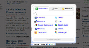
Add This is a popular sharing platform with a huge list of services readers and users can share through. The interface isn’t unpleasant (as many catchall interfaces are), and it can be customized to feature small or large buttons for popular services. Buttons with share counts are also available, although this beta feature isn’t as visually appealing.
Add to Any features the most streamlined sharing button we’ve seen. This service’s stats can be rolled into Google Analytics.
Share This is a similar service with a UI that features a small, single button, large icons, or even larger icons with horizontal or vertical share counts.
2. Use Only What You Need
Give your users only the buttons they’re actually going to use in significant numbers. This frees your page from clutter and frees your users from irritating and possibly confusing fly-outs, all while providing compelling, actionable buttons for the services that affect your traffic the most.
Most social sharing services will have buttons and code for you to grab — check for resources provided by the service you’d like to include.
Twitter and Facebook work well as sharing buttons for almost every kind of content. An RSS button is good if your audience is nerdy enough to appreciate RSS, and include an e-mail button if you’re cultivating an older or less “public” demographic — or if your content is sensitive or personal.
A Hacker News button works great if you’re going for a technical audience. Likewise, Digg or Reddit buttons are best if you’re aiming for virality with a general and web-minded audience, and Stumbleupon is useful if you’re going for casual and social browsers.
Ultimately, the best practice is to take note of where your current traffic is coming from and optimize. If 70% of your non-search traffic comes from Google Reader and Twitter, maybe a Twitter button and RSS button are all you need.
Don’t go overboard. Aim for less than three buttons for social sharing, and house them within one widget.
3. Where to Put Sharing Buttons
The bigger the button the more clicks it will receive???? While this is true of call-to-action buttons that actually create conversions and sales, the rule doesn’t always apply to your social media buttons.”
Cleverly placed social media buttons strike the right balance between content and promotion. They don’t draw too much attention to themselves, but they are simple to find.
You should include your sharing buttons “above the fold” on all relevant web pages — that is, it should be visible as soon as the user loads your page, no extra clicking or scrolling required. In some cases, especially if you tend to write long blog posts, you can also include sharing buttons at the end of the post.
Have Fun Take your time Justin Matthew
We represent multiple major corporations and they are available for references. [email protected]
www.ownsocialmedia.com
www.monopolizesocialmedia.com
https://www.facebook.com/MonopolizeSocialMedia
https://plus.google.com/u/0/+JustinMatthewSocialMedia/posts
https://plus.google.com/u/0/+Monopolizesocialmedia/posts


